Monday, 12 December 2011
Avenged Sevenfold DigiPak (taking ideas)
The last blog i did was about the 'Avenged sevenfold' DigiPack. After analyising it i thought to look through it and see what our group could take from it. In the booklet i saw that band had animated pictures of themselves which set up one of my first ideas of having pictures of our animated (maybe using the southpark engine). Layout of the inside CD cover also interested me as it's the band logo printed alll across the 3 folded pages. This gave me the idea of having a band member doing something obscure across each of the pages. And last but not least the CD's. The CD's have relevent images to the band name and album name on it. I'm not entirely sure of what we could print on the CD's but patrick liked the idea of a band photo, So far that's what we're aiming to do untill someone can come up with alternate ideas. With countless bands doing something along this line we would have to make it different somehow, after a couple of discussions we thought we could have an idea of 3 of the members acting seriously but with the final member doing something different. These ideas aren't set in stone but this is what we will be working towards untill maybe one of us comes up with another suggestion.

Narrative Theories
Narrative theory is nearly always present in films and music videos, even music videos that do not even have any narrative in them. There are four main narrative theories that were created by Tzvetan Todorov, Roland Barthes, Claude Levi-Strauss and Vladimir Propp.


Todorov's Theory
Todorov was a Bulgarian literary theorist. He suggested that most narratives start with a state of equilibrium meaning that everything is normal in life and that there is no danger or harm. Then life is brought into a disequilibrium, meaning that trouble has been caused and that normal life has been significantly disrupted. He suggested that this state of normality is disrupted by an outside force and is forced to be fought against to return to normality. Once the outside force has been fought the state of equilibrium is then returned and normal life is carried on.
Barthes's Theory
Barthes was a french semiologist. He suggested that narrative works in five different codes which in turn activate the reader to make sense of the narrative being transcribed. The first code is Action. This means that a resolution is produced through action e.g fighting of a man to win the woman you love. The second code is Enigma. This teases the audience by presenting a riddle or puzzle that has to be solved in order to establish a resolution e.g finding out who is black-mailing a person by looking at the clues they've left. The third and fourth codes are Symbolic and Semiotic. These the same thing yet also the opposite as they represent connotation and denotation. These are the signs and motif that are present within a narrative such as a gun or a special book. In the James Bond films, a motif would be that he always asks for a Vodka Martini 'Shaken not stirred'. These can also be opposites for example calling someone 'strong minded' is a positive connotation yet it is also the same as saying they are 'Stubborn' which is a negative connotation. The fifth and final code is Cultural. This is where the audience can recognize as being part of a culture e.g The Godfather and being part of the Mafia culture.

Levi-Strauss
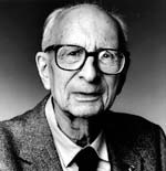
Levi-Strauss was a social anthropologist who studied mythes of tribal cultures. He examined how stories unconsciously reflect the values, beliefs and myths of a culture. His research has been adapted by media theorists to reveal underlying themes and symbolic oppositions in media texts. For example binary oppositions: Home Steaders V Native Americans, Christian V Pagan, Domestic V Savage, Weak V Strong, Garden V Wilderness and Inside Society V Outside Society.
Vladimir Propp
Propp's theory was that he suggested that every narrative had character roles that included a villain, a dispatcher, a helper, a seeker hero, a prize and a doner. A stereotypical example would be a villain takes a girl to his lair. The seeker hero has to travel to save the girl but confronts challenges along his way. He meets the helper who accompanies him on his quest and helps him. The doner gives them something that will also help them e.g a map, advice, a sword etc. Once the villain is defeated and the hero saves the girl, they fall in love and she is his 'prize'.
Digi pack analysis
The analysis of the Alfonz cd cover showing a well thought out design starting off with the actual front cover itself. Shows humour in the pictures on the front cover as drawings which we are assuming are them , shows them over exaggeration of their boyish pretencies .The layout and detail on the front shows proof of some sort of promotion of the Alfonz and what they are trying to betray themselves to the audience such as, having the drawing be funny as well as begin over the top to show them begin unique and over the top good .And the fact the drawings itself was drawn on paper shows they are trying to attract a more teenage age group .This helps create a connection to audience itself using this this method to help make the them stand out more .But in general there layout has been used effectively showing a bit of abstract and nominalism to the front cover . |

The back of the Alfonz Cd cover shows a sense of the audience begin a class room due to the use of the wooden like texture and paper .Giving an image of begin in a classroom proving that the audience in which they are trying to betray themselves to is a more teenage area. As well the back cover shows them being on the rebels side of school due to the words begins engraved in trying to attract the female mind who like the “bad boys “ yet again doing this helps the Alfonz to expand their audience. 

|
Digi Pack Analysis

Right now we have only created a rough idea of our Advertisment page for our band but apart from some missing information the basic layout will be something like this .
Sunday, 11 December 2011
filming
To start with we filmed our pub setting. This consisted of me and matt being the main characters, when looking at our footage we realised a lot had gone wrong and wasn’t fitting with the look we were trying to create. We hadn’t thought about lighting aspects or about camera movements, we had mainly still shots. Then, due to the sudden change is actors, we needed to re-film it completely anyway. The next step was to set up PK’s garage to film in to make it appear like a ‘band practice’ look. We wanted an alternative, underground look – very typical of an indie band to use to practice and PK’s garage seemed perfect. The garage has a ‘organised mess’ look to it, showing how lived in it is and how the band has the main use of the garage. We used extra lighting to create filler lights to evoke the right lighting – in particular across our main singer joe’s face. We took all the equipment to Pk’s garage and set up the drum kit, amps and microphone so that when our actors we available we could get straight on and film. In most of the filming, tom was our main camera man however as tom was in the band, Pk filmed. The framing of our shot was important and the garage was surrounded by wall. We wanted about a foot off wall to be in some of the shots all the way around to show the garage setting. Pk also had a punch bag in his garage which we felt was perfect for help setting the scene and add to the indie, urban sort of feel. There was also a ladder which we thought’d be really useful for the high angled shots of the band. Once the filming had been done, we looked at what it looked like and were really pleased with the overall look of the shooting! We felt there were a few close ups missing and needed a few more with a moving camera to create the dynamic look and essence of the band. Luckily, all the equipment was left from the previous filming and so it would be consistent. When filming the first time, Tom had suggested filming twice with different lighting, so we could then look at the footage and decide which would be more suitable and create the effects we wanted. This really paid off when we could see how the lighting influenced the shots and could then make a decision to use the extra filler light. Next we shot the scenes at the girl’s house. We had to wait until it was dark as the lighting in the windows was too obvious it was day time. The shots included them walking in and then the walking upstairs. We wanted to get interesting shots and so through the banister and up the stairs we interesting angles to shoot from. This was shot later than the walk home, and so it was important that the beginning of the scene – where the couple walked up the drive and home was the same style and structure as the walking home shots. 


Ellie
Wednesday, 7 December 2011
Digipack and Advert Idea
For out ancillary tasks, we need to create a magazine advert and Digipack.


 Ellie
A digipack is s type of CD packaging, with images of the band that accompanies the CD and has extra information about the artist or band as to provide extra for the fans. A digipack can flip open and has panels, usually 3 to allow the CD to go in he middle – much like a traditional CD package but allowing the extra panel for more information and images. ‘Digipaks’ originally came from Mead Westcavo, but their product caught on quickly and soon became the term ‘digipack’ none trademarked.
Digipacks can have 4, 6 or 8 panels along with a small (approx 6mm) spine.
Features of a digipack – name of artist, album, track listing, booklet, price, bonus material, website, credits recording information, producer/director, time/place recorded, song writer, images, logo, record label logo, barcode, website address.


Generally in magazine adverts, the artists tend to use the same image and font as used in the digipack or CD cover, so as o have continuity and then when customers see the CD in a shop or online it is eye catching as they have seen it before and it jogs their memory as seeing something wanted to buy. The advert is mainly just an image and the title of the band or artist. This represents that the music is pure, the image and font show enough about the artist. A pop act might use a sexual image to appeal to their target audience. This would also be reflected in the magazine that the advert would have been shown in. This image shows how the advert links to the digipack.


For our magazine, we have carefully looked at our target audience. We have found that we wanted to appeal to both the male and female youth audience, who has a is middle class, therefore appealing to C1. To reach these through magazines there are 2 sorts of magazines we would need to consider. From careful research, we were thinking we would advertise is NME. This is a magazine made for music. It current and up to date and is perfect for a new band trying to ‘make it.’ This would appeal to committed music addicts, probably male dominated, who are constantly trying to find new bands to follow. We would also need to appeal to the female market. We would appeal to the female market through choosing a magazine that young teenagers would be interested in. from thinking about this, the best magazine for a female who would like a Indie boy band would be one aimed at young adults – 16 to 24, middle to working class, with some disposable income. Therefore, we feel that the best magazine would be a relatively cheap, gossip and fashion magazine. It important its not just a fashion magazine such as glamour or vogue as this is would reach the wrong audience, its also important that its not a TV gossip one as this would be more aimed at older people to get the T listings. In general we’ve concluded that a magazine like more! This is a relatively new magazine, increasingly popular, and quickly becoming the most popular women’s weekly magazine. According to ABC circulation figures,, they said “the Young women’s lifestyle magazine more! is the fastest growing glossy in the market with an exceptional
double digit increase in circulation on the year to 190,708. More! relaunched last September and is the only weekly lifestyle title that offers a combination of aspiration but accessible fashion and beauty alongside relationship advice that cuts through to reach 18-25 yr olds.
double digit increase in circulation on the year to 190,708. More! relaunched last September and is the only weekly lifestyle title that offers a combination of aspiration but accessible fashion and beauty alongside relationship advice that cuts through to reach 18-25 yr olds.
Jo Morrell, Acting MD of more!, commented:
”more!’s stunning circulation performance shows just what great shape the title is in, outperforming all other glossies in this competitive market. more! is still one of the most influential and adventurous titles on the newsstand and I know it will continue to evolve this winning formula and unrivalled position as the confident voice of young women in the UK.””
For our ancillary tasks, we have come up with a clear idea of some shots we could use in our digipack and then transfer one into our magazine advert. We have come up with some shots of in a supermarket or using trolleys. Trolley racing is a joking ‘banter’ concept that would show their young, indie style and make them immediately liked. This would synthetic personalization as connecting with the audience on a closer relationship forming. From looking into this, we felt it would be better to make the supermarket trolley shop more of a running theme and so ideas such as on a conveyer belt, shots down each isles as in the freezer setting, using blurry effects and then in the car park inside all the trolleys. The flat escalators would be good to get a shot of them in the supermarket in the trolleys but because of ethic issues with the super market we felt it might not be plausible to follow this through. We had other ideas, we thought of doing the classic Beatles shot walking across the zebra crossing but often these shots can look awful and come across tacky. We had another thought of creating ‘mug shots’ where we can use a big white screen and have shots of they members faces holding a card.
The Planing stages of our digipack
Digipack Stages
The stages our digi required information and reasearch containing our competetion wise and inspirations for our own digipack design.
With the reasearch of the digipack it turns out the are multi types of digi packs in which uses simliar abilites and each surprisingly have there own reason for there layout as well as the structure And by knowing these aspects we can get a more clear vision of what our final outcome will look like . An example of the types of layouts there are is the classic two sided cover mostly used for promotional purpose and uses a very simple layout showing not too much unqiue design but the concept can be easily massed produced making the reason for this design to be so desirable.Another example will be foured sided cover these are mostly used for multi artists in the cd alone requiring more space for the actual covers to contain song lists and other aspects , But with this design some artists chooses to uilitze the exspanded space to exspand the band image by ethier placing images of themselves onto the actual cover or even extra features to the cd in which would be a method of marketing to attract consumers to purchase the albums for the extra feature than to download online.

This will be an example of an a simple 2 sided digipack ,As you can see its not too difficult to produced and suitable for any kind of artists and band users . This will be the digi pack choice we are more likely to produce due to the actual production process as well as the ideas and layout of the design has lots of opportunities due to the small band we are trying to promote and if thinking more in a buisness area will cost less to produce in a mass production .

This will be the image of the 4 sided digipack which may seem not the best choice but defitinte consideration of doing due to the fact we are able to really exspand our bands image and bring a better sense of class will with the use of features of the cd added . This would help give the consumer a taste of the lifestyle of each band member creating a connection to there own lifes and becuase our band is focused on showing how normal teens have become rockstars really helps us convince the consumer they are caplable of what the band members in this digi pack can do ,using the bands members as a goal become them.
The stages our digi required information and reasearch containing our competetion wise and inspirations for our own digipack design.
With the reasearch of the digipack it turns out the are multi types of digi packs in which uses simliar abilites and each surprisingly have there own reason for there layout as well as the structure And by knowing these aspects we can get a more clear vision of what our final outcome will look like . An example of the types of layouts there are is the classic two sided cover mostly used for promotional purpose and uses a very simple layout showing not too much unqiue design but the concept can be easily massed produced making the reason for this design to be so desirable.Another example will be foured sided cover these are mostly used for multi artists in the cd alone requiring more space for the actual covers to contain song lists and other aspects , But with this design some artists chooses to uilitze the exspanded space to exspand the band image by ethier placing images of themselves onto the actual cover or even extra features to the cd in which would be a method of marketing to attract consumers to purchase the albums for the extra feature than to download online.
This will be an example of an a simple 2 sided digipack ,As you can see its not too difficult to produced and suitable for any kind of artists and band users . This will be the digi pack choice we are more likely to produce due to the actual production process as well as the ideas and layout of the design has lots of opportunities due to the small band we are trying to promote and if thinking more in a buisness area will cost less to produce in a mass production .
This will be the image of the 4 sided digipack which may seem not the best choice but defitinte consideration of doing due to the fact we are able to really exspand our bands image and bring a better sense of class will with the use of features of the cd added . This would help give the consumer a taste of the lifestyle of each band member creating a connection to there own lifes and becuase our band is focused on showing how normal teens have become rockstars really helps us convince the consumer they are caplable of what the band members in this digi pack can do ,using the bands members as a goal become them.
Subscribe to:
Posts (Atom)